I started by understanding what the internal team actually did all day—tracking platform health, managing organization subscriptions, and resolving support issues. Their work had nothing to do with the project management features that org owners and employees used. So I organized everything around three main areas.
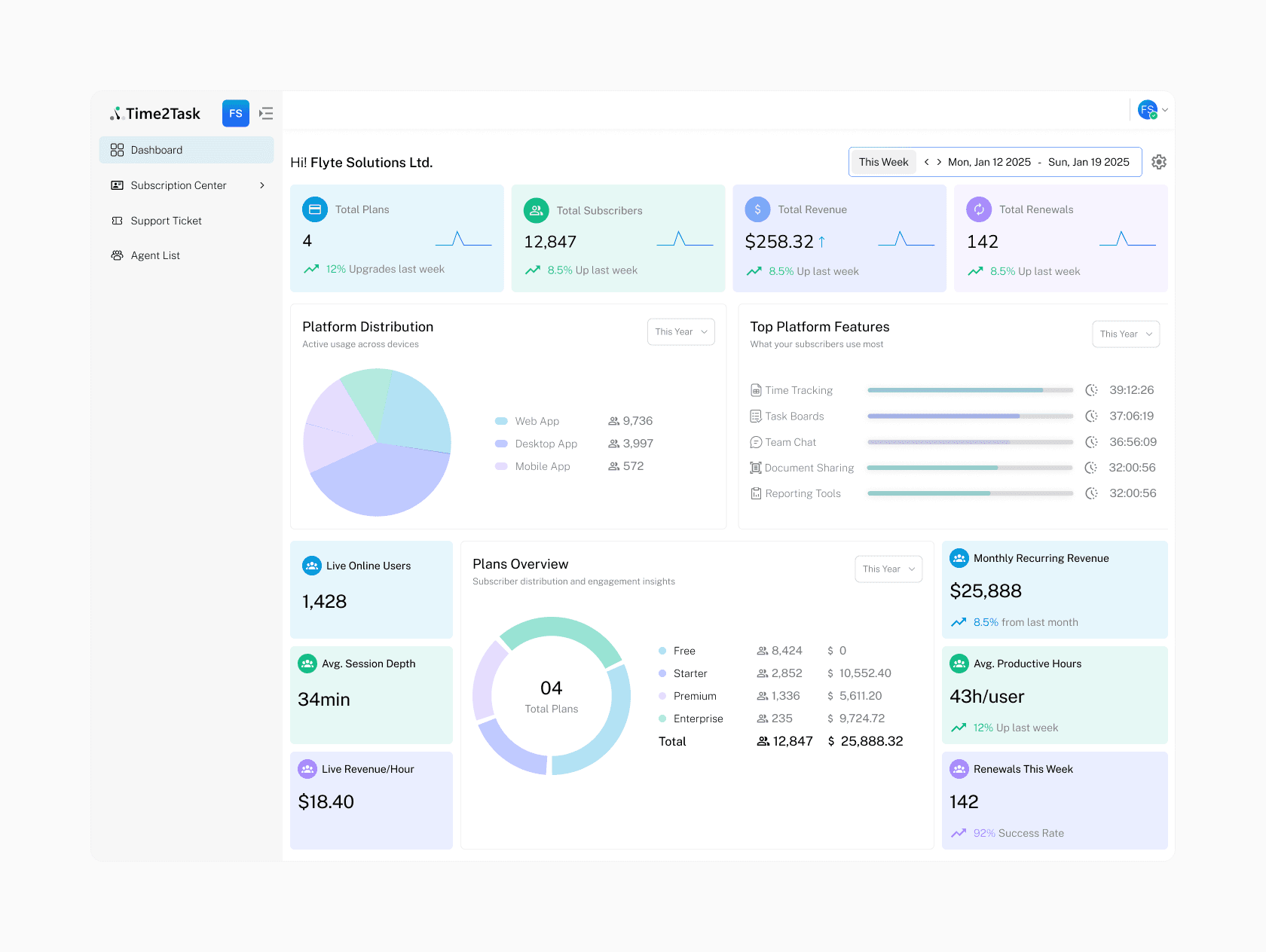
Dashboard – This screen was meant to kill the weekly Excel report. I put live stat cards right at the top for Monthly Recurring Revenue, active organizations, and open tickets. Below that, simple line charts show sign‑up trends and ticket resolution rates. Everything refreshes automatically, so the team gets an instant morning pulse check. Clicking a spike in tickets takes them straight into the queue.
Subscription Center – This is where they manage the business. I split it into Plans and Subscribers. On the Plans side, admins can create, edit, and reorder plan features with drag‑and‑drop. The Subscribers table lists every paying organization, with inline actions built right into each row—upgrade, downgrade, cancel, or refund—all through a slide‑out drawer that shows the billing impact before they confirm, so context is never lost. Clicking an organization opens a detail view with a visual timeline of every plan change and billing event. Invoices are downloadable right there. No digging.
Support Tickets – Email chaos got replaced with a proper priority‑colored ticket queue. Filters for “unassigned,” “open,” or “my tickets” let agents zero in fast. When a ticket opens, a split‑pane view shows the full conversation on one side, internal notes and a canned‑reply library on the other. Everything sits in one view, so agents never hop tabs or lose the thread.


Design isn’t just layout—it’s how the interface behaves. I worked closely with the developers to make every action feel immediate. For subscription changes we used optimistic UI: the moment an admin confirms an upgrade, the interface updates instantly while the backend processes in the background. If something fails, we roll it back gracefully—no awkward pauses.
The dashboard and ticket views run on live WebSocket connections, so new tickets pop in and revenue numbers shift without a manual refresh. For heavy data like the subscribers list, we leaned on server‑side pagination and virtualized scrolling so even thousands of organizations scroll smoothly. While things load, skeleton screens and empty states keep the interface looking deliberate, never broken.
The numbers told a clear story. Subscription management tasks dropped by 80%. Support first‑response time fell by 35%. More than that, the internal team finally had a tool that matched how they actually think and work. The console became their daily command centre, replacing manual reports with live clarity they could trust.

